Orbyte
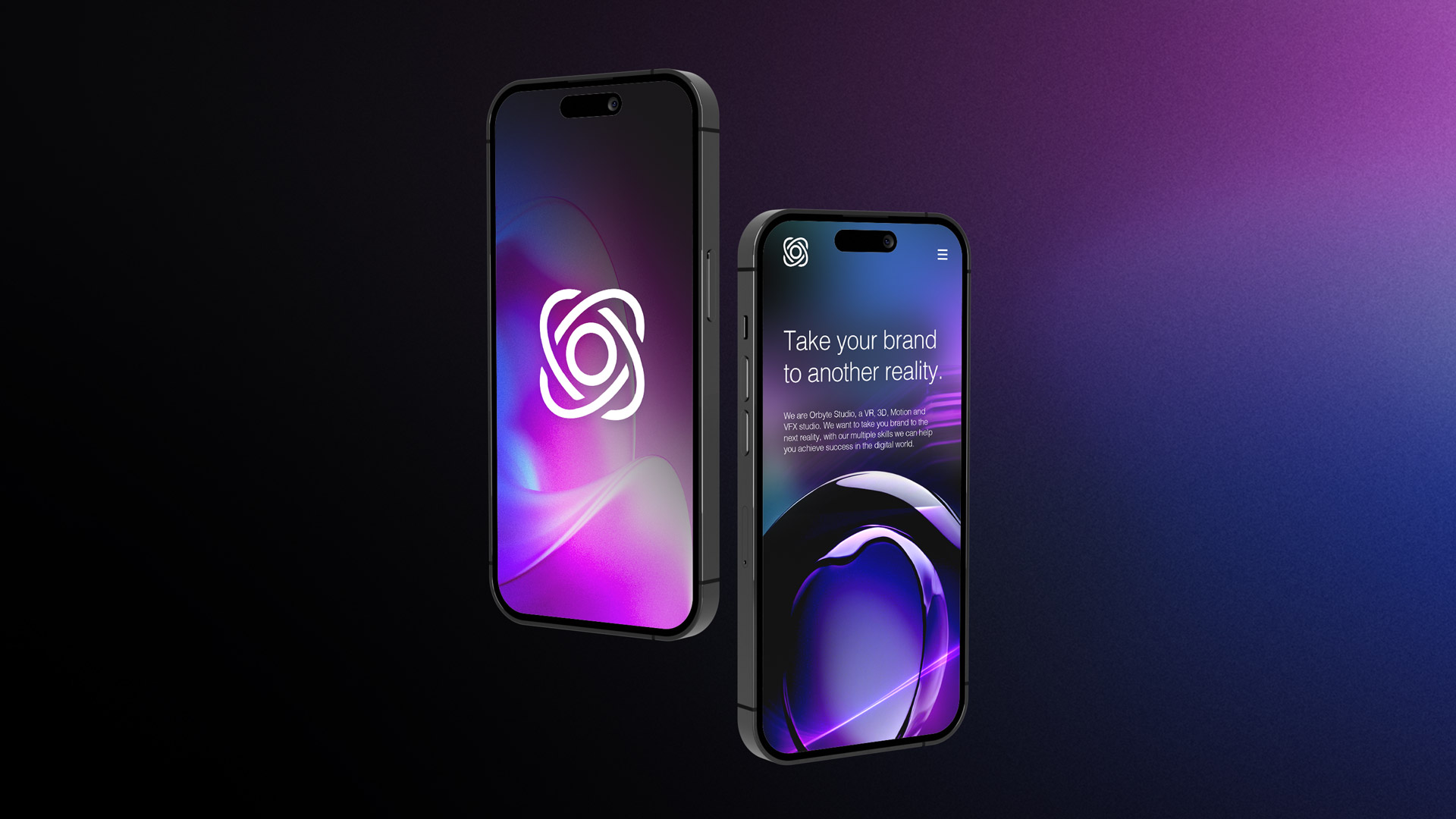
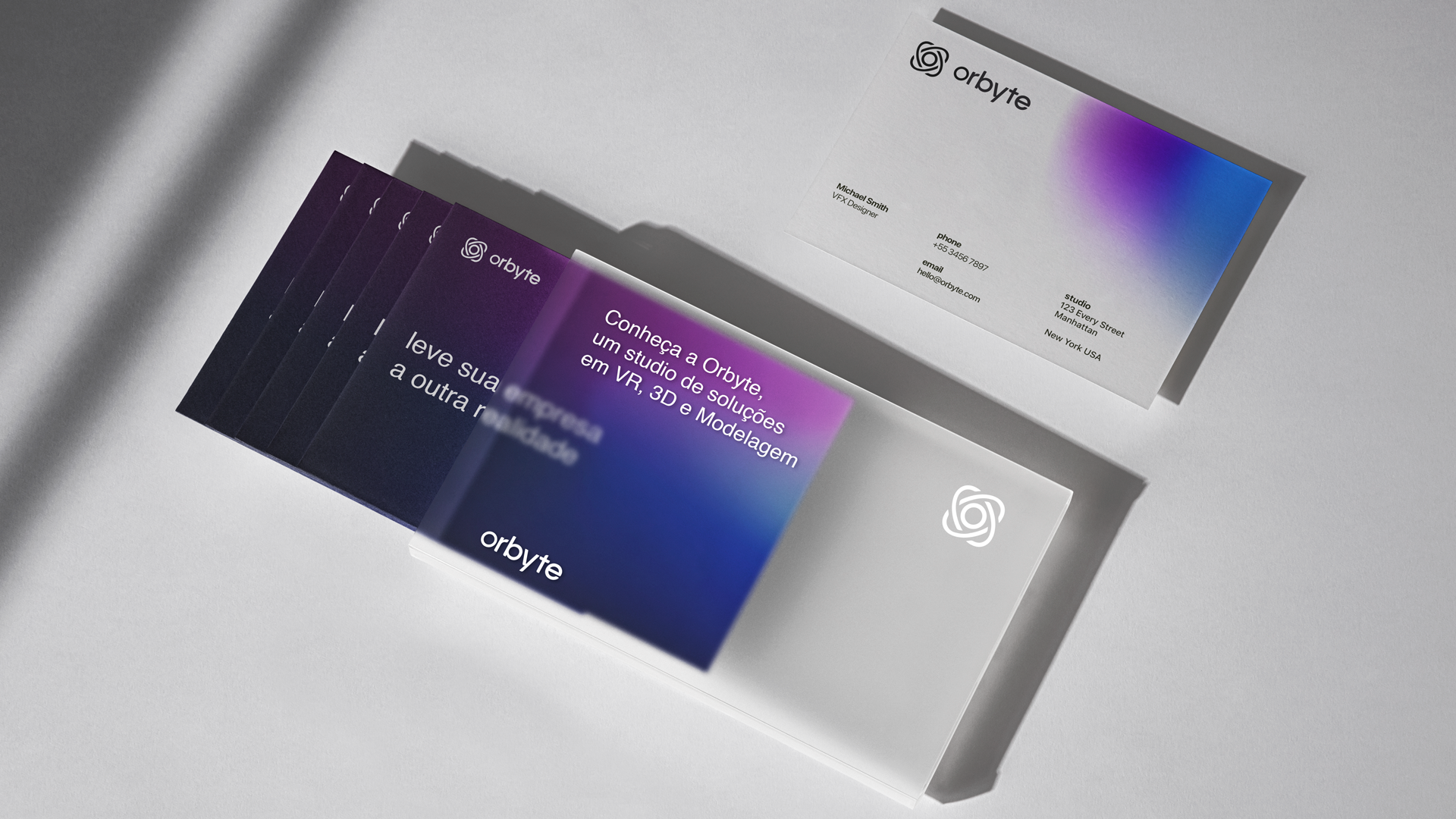
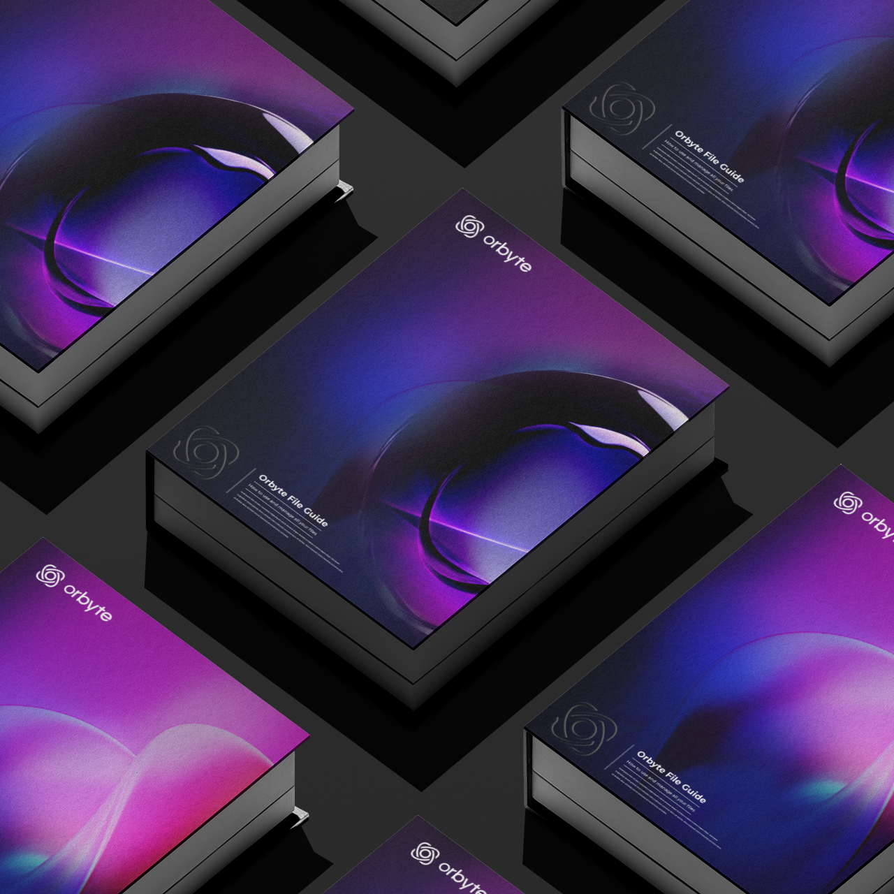
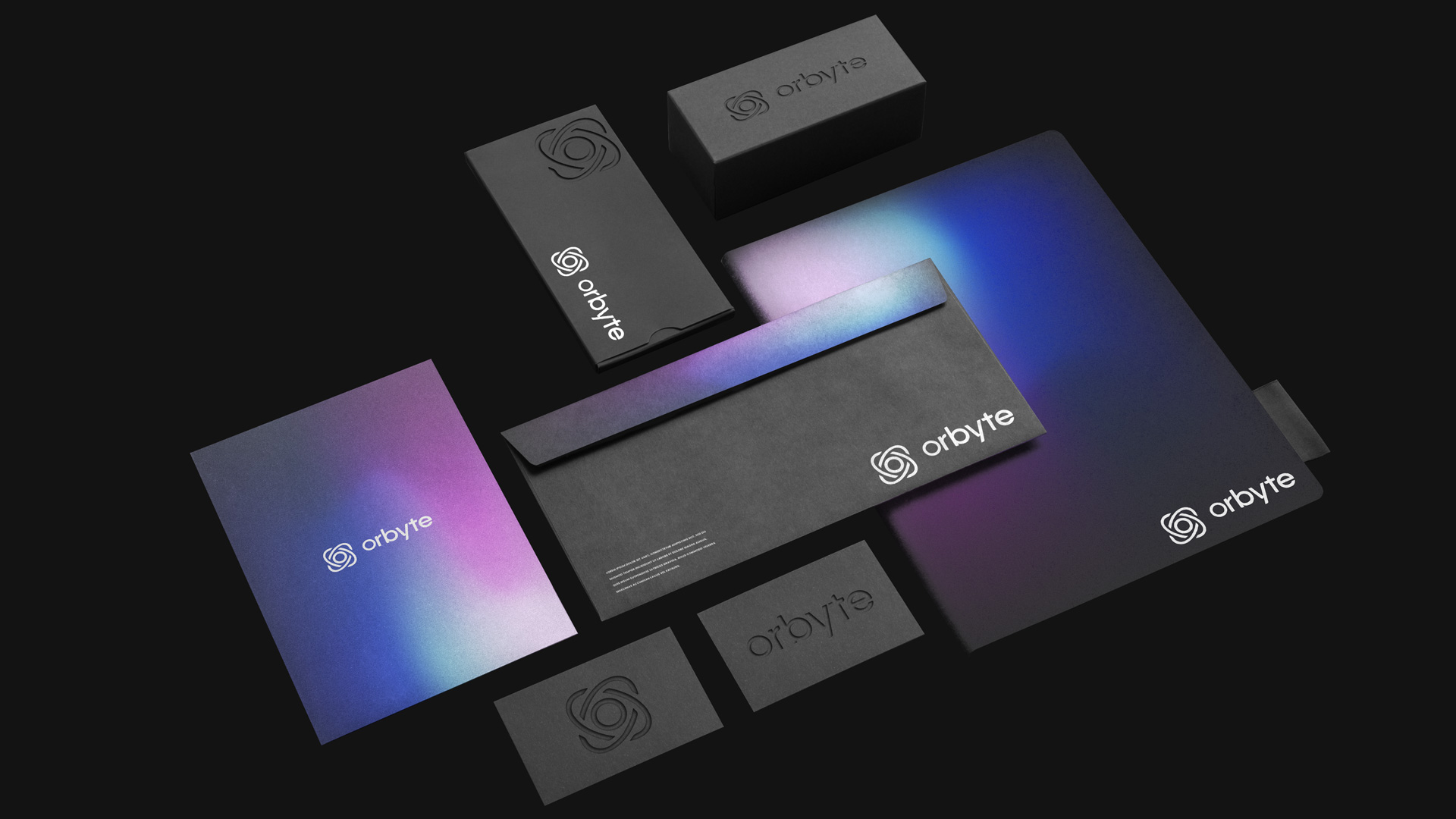
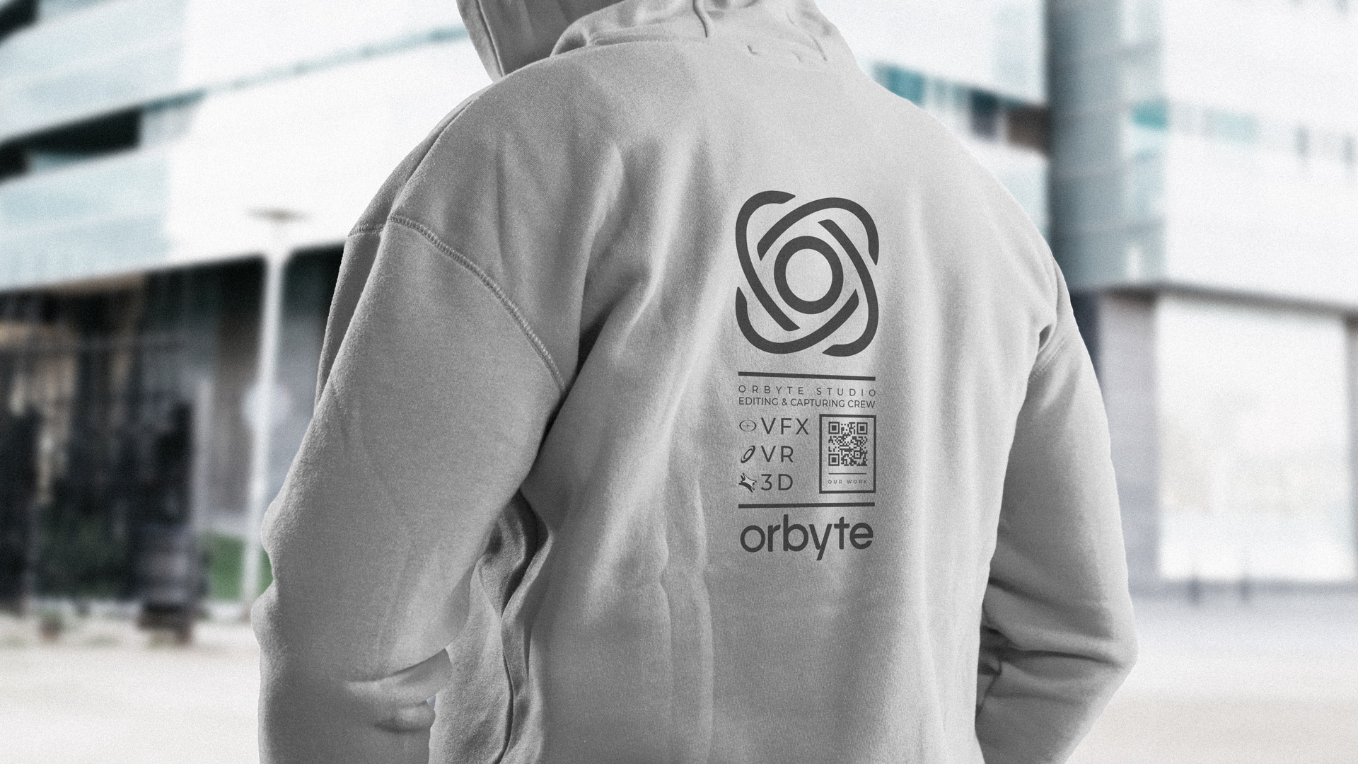
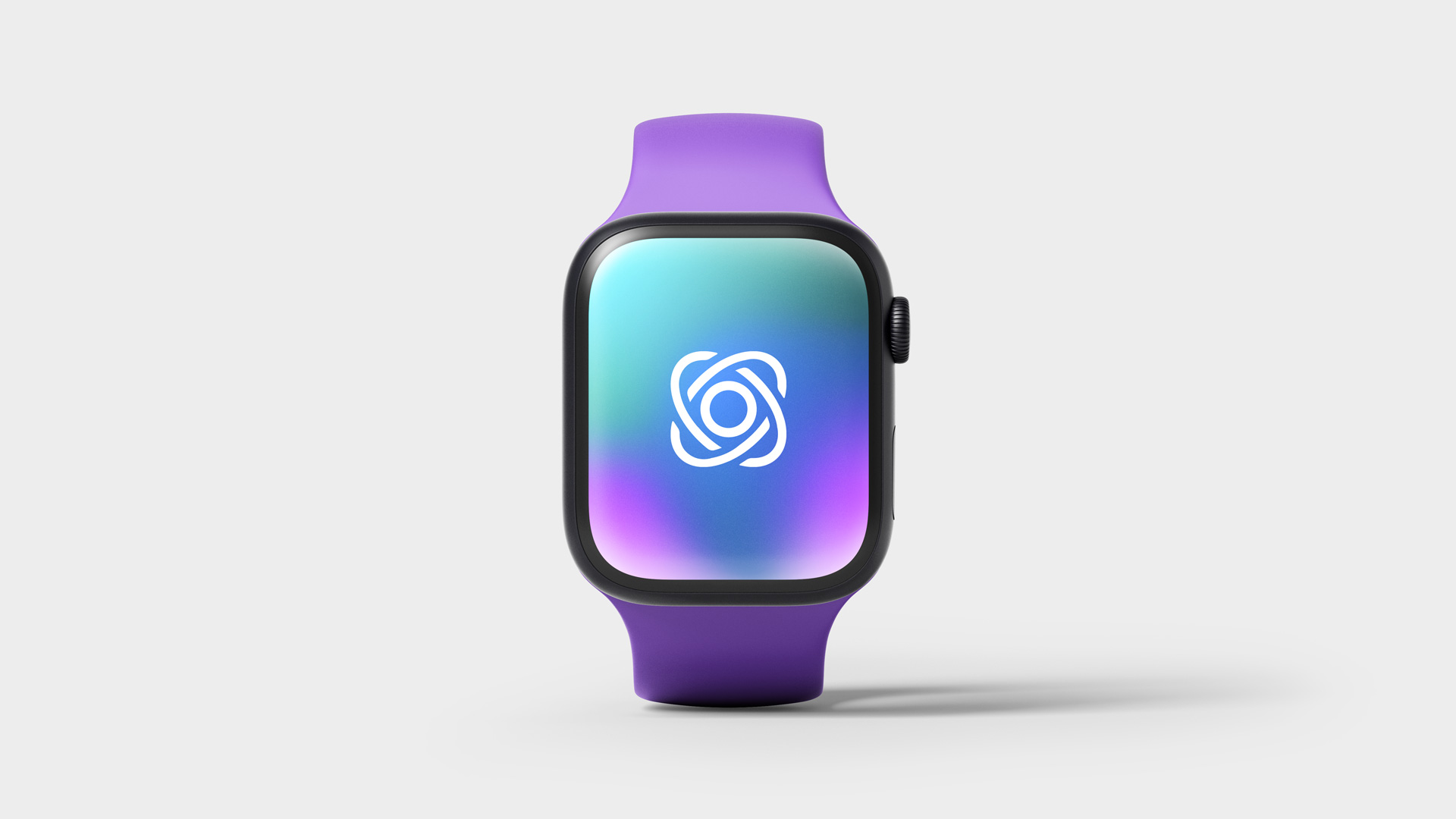
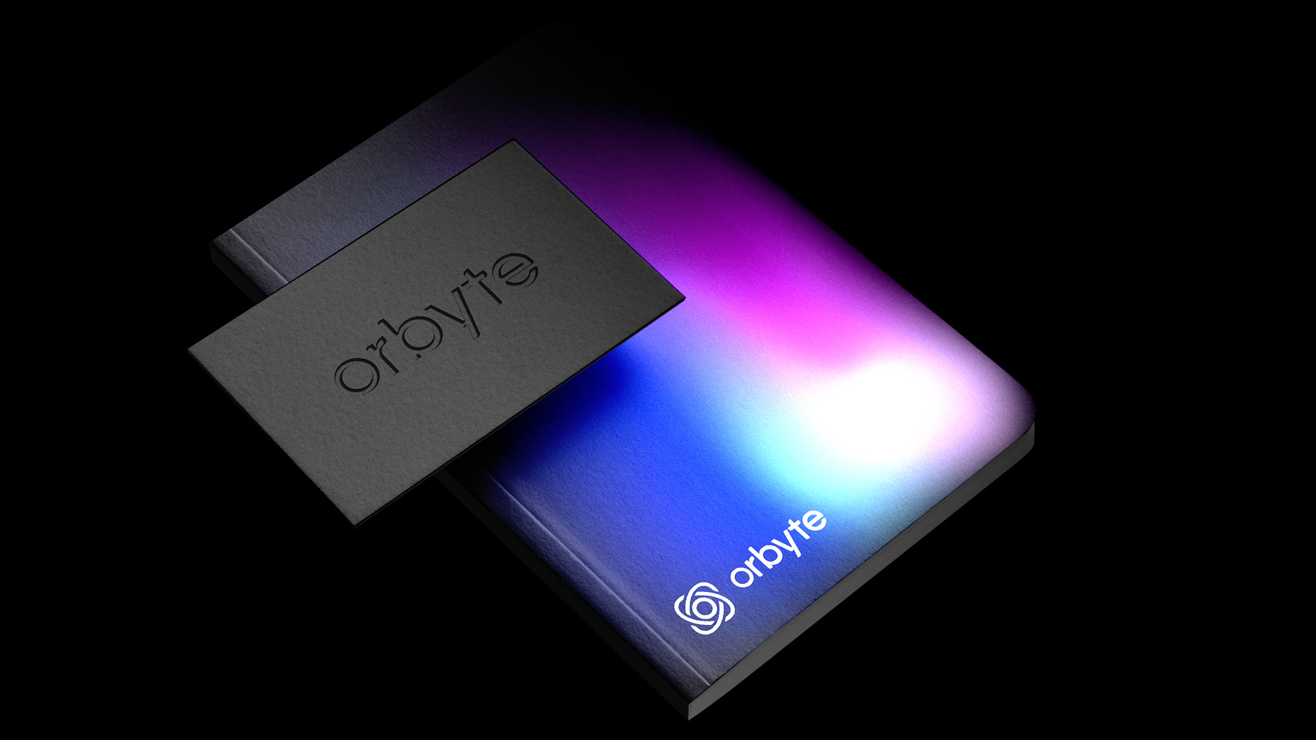
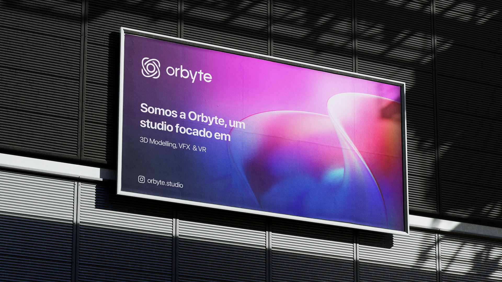
The visual identity for Orbyte Studio was designed with a minimalistic and contemporary approach, reflecting the studio's connection to innovation and technology. The logo concept combines the elegance of a planetary orbit with the dynamism of a 3D moving axis, creating a design that feels modern, balanced, and timeless.

At the core of the logo, the "O" symbolizes a planet in motion, highlighting fluidity, connection, and exploration—values that align with the studio's creative vision. The typography is sleek and geometric, paired with clean lines that reinforce the sense of simplicity and professionalism. The identity system was built to be flexible and impactful, integrating modern design principles to ensure consistency across digital and physical applications. This visual language, rooted in minimalism and sophistication, establishes a strong foundation for the brand’s presence in the fast-evolving digital landscape.